Portuguese Stone
A corporate site to promote Portuguese natural stone in international markets.
Visit portuguese-stone.com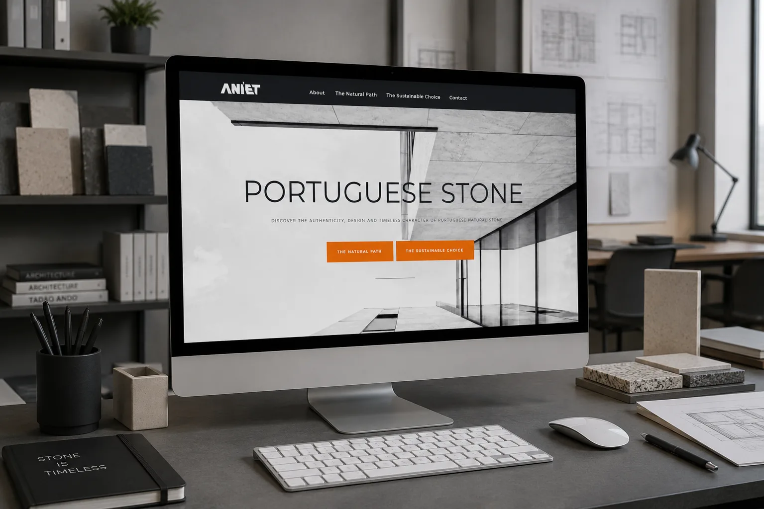
Letting the stone fill the screen
A grid of thumbnails all the same size flattens the material. Stone lives on texture and scale, and a small photo shows neither.
A mosaic gallery with varied proportions, where each image takes the space its framing asks for, and opens large on click.
The newsletter read in the browser, nothing to download
ANIET publishes dense editorial content on sustainability and construction. As a PDF, that gets lost: it forces a download, opens outside the site and can't be measured.
- Format
- 32 flip-through pages inside the page itself, with arrows and thumbnails
- Bilingual
- English and Portuguese side by side on the same spread
- Controls
- Zoom, full screen, grid view and direct sharing
- Alternative
- A link to download the infographic, for those who prefer the file
The editorial decision
The challenge of selling stone to international markets
You don't do it with a product list. You do it with authenticity, design and the idea of a timeless material. The site had to convey that, in English and with a sober, premium image.
Two paths that complete each other
We organised the site into two journeys from the hero: one dedicated to architecture, design and the expression of the material, the other focused on sustainability, circularity and responsible construction.
The direction is minimal, with light typography and plenty of space, to keep the stone in the foreground.
Two paths, one material
Architecture and design on one side, sustainability and circularity on the other. A single brand.
Made for the world
Content in English, an editorial tone and a sober visual, designed for international markets.
The stone in the foreground
Minimal design that lets the material breathe, with light typography and plenty of space.